Loading the Narative

← Prev

Simplifying Healthcare Registration Steps

Click Here, Click There, Click Everywhere – Just to See a Doctor

App Mockup

Overview

Type
Study Case
Design
Mobile App
Timeline
5 Weeks
Product
The Depok Single Window is a municipal government application designed to streamline and improve access to essential public services for residents of Depok including health center services.

Highlight

Design Mockup
Highlight
Design mockup IMAGE
Highlight
Design mockup IMAGE

Context

Transforming Healthcare Access
For many residents of Depok, accessing public healthcare services through the Depok Single Window (DSW) application was more frustrating than helpful.
Rating & Reviews
App Review
User review IMAGE
Timeline
Timeline
Timeline IMAGE

Problems

A Broken User Experience
Mothers trying to schedule immunizations for their children found themselves stuck in an endless loop of failed registrations.
Imagine having to go through this many pages—just to register. Some of them even require double taps to proceed. Now multiply that by the frustration of users who simply want to access public health services quickly. It’s no surprise the process feels exhausting and inefficient.
Old Registrations Flow
Old registrations page flow IMAGE

Redesign

A More Intuitive & Accessible Solution
Previously, health center registration was overly complex with redundant steps, making it frustrating for users. Now, the streamlined design guides users directly through essential steps, enabling quick, efficient registration with a clear success confirmation.
App Stucture
User flow IMAGE
Streamlined Registration
We eliminated unnecessary steps and redundant pages, creating a direct and intuitive flow that guides users effortlessly through the process. Now, new patients can register quickly, with clear success confirmations.
Redesigned Pages
Redesigned pages IMAGE

Interaction

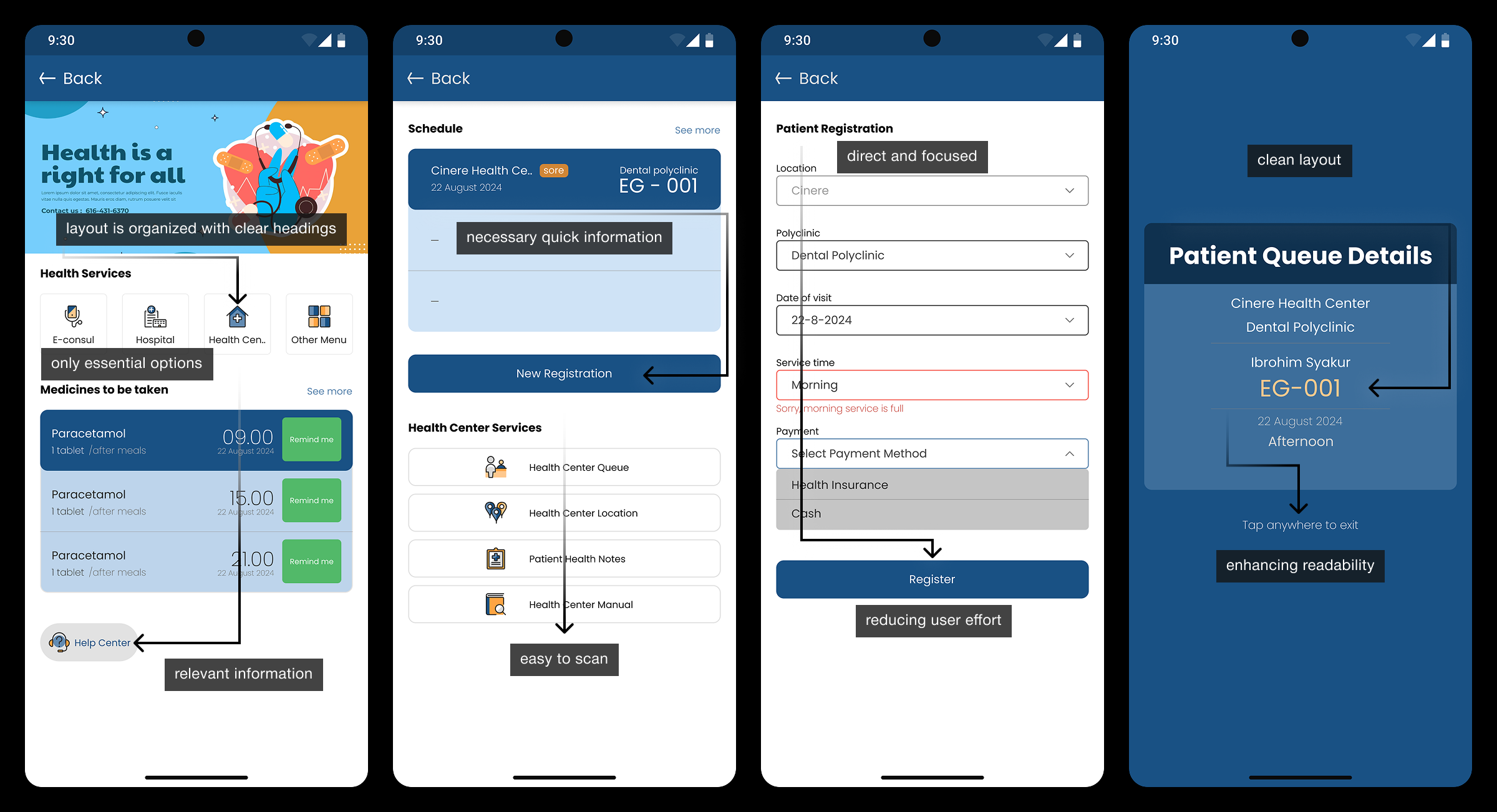
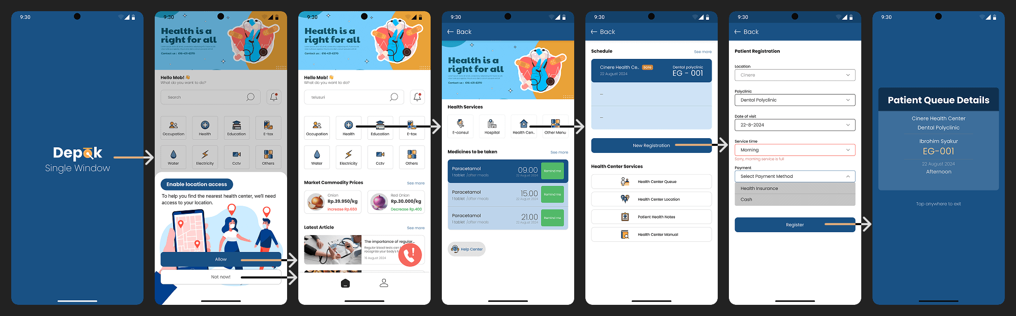
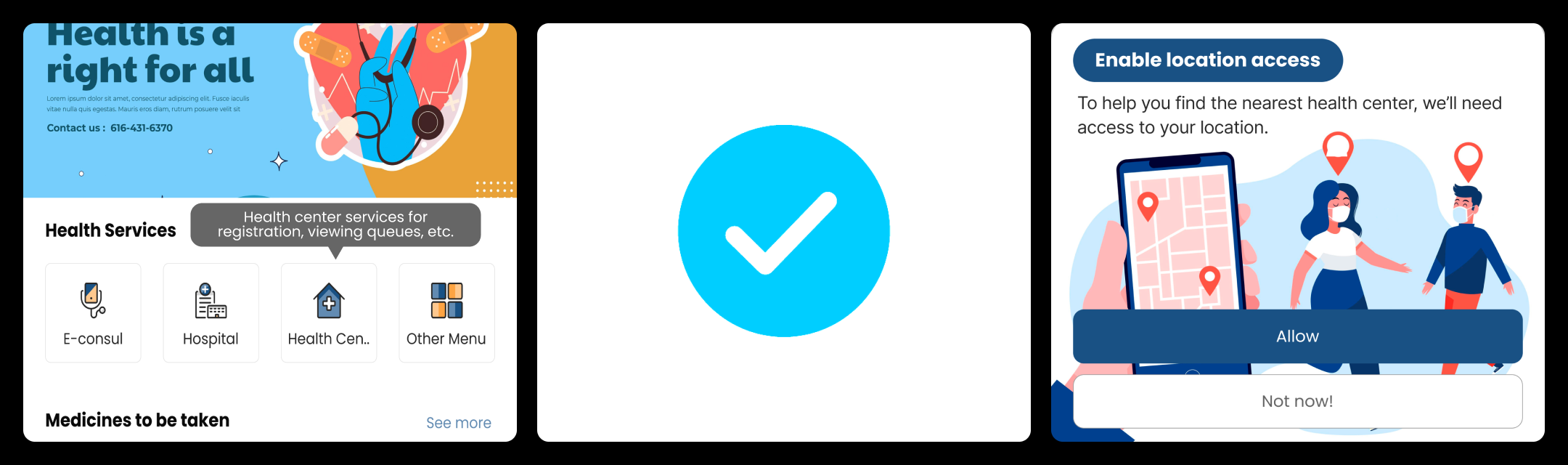
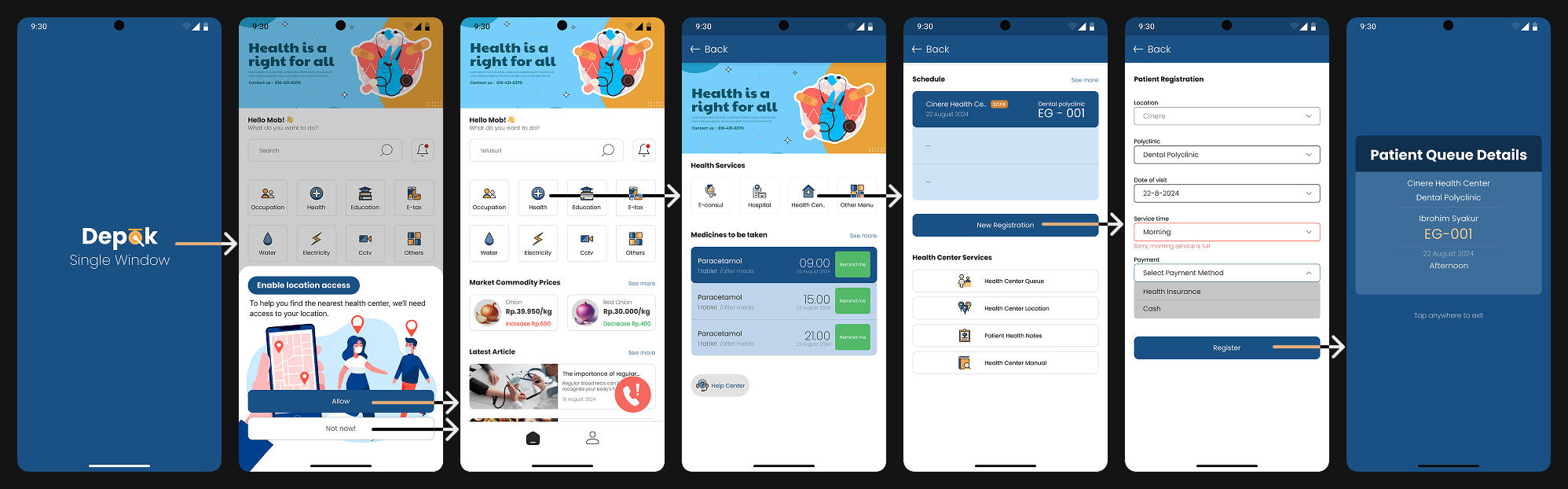
Enhancing User Engagement
Beyond functionality, we wanted the DSW app to feel modern, polished, and engaging. To achieve this, we introduced:
Smooth Animation
A welcoming loading animation creates a seamless first impression, reinforcing the app’s identity without causing unnecessary delays.
User flow IMAGE
Interactive Feedback
Buttons respond with subtle color shifts and micro-interactions, successful registrations are celebrated with a small lottiefiles animated confirmation, and when users know their location is used to suggest the nearest puskesmas.
Micro Interaction
Micro interaction IMAGE

Final Design

A Polished User-Centric Experience
The new DSW design prioritizes simplicity and usability. A structured grid system with consistent spacing ensures balance and clarity. Content is now scannable, intuitive, and free of clutter—empowering users to navigate effortlessly.
Final Design
Final design IMAGE

Impact

A Measurable Improvement
The results speak for themselves. Usability testing showed a 100% success rate in completing the registration process, with an average completion time of just 48 seconds—a significant improvement from the previous experience. Error rates dropped to just 8%, and user feedback reflected higher satisfaction with the app’s ease of use and improved navigation.

Discover More

Thumbnail Starbucks

Starbucks
Streamlining Starbucks Merchandise Flow

Thumbnail Agha

Agha
A UX Approach to Inventory Tracking